As a small company, they jumped from just a few hundred thousand dollars in sales in their first year, to well over $12 million in their second year. Their new success came with new problems. They had to change their name so as to not draw confusion or association with another popular men's grooming company. They were growing quickly, and their current website wasn't designed to handle the new demand.
A new visual identity was at the top of the list. One that was familiar to their core audience of 'brothers in beards' and yet refined enough to reflect quality.

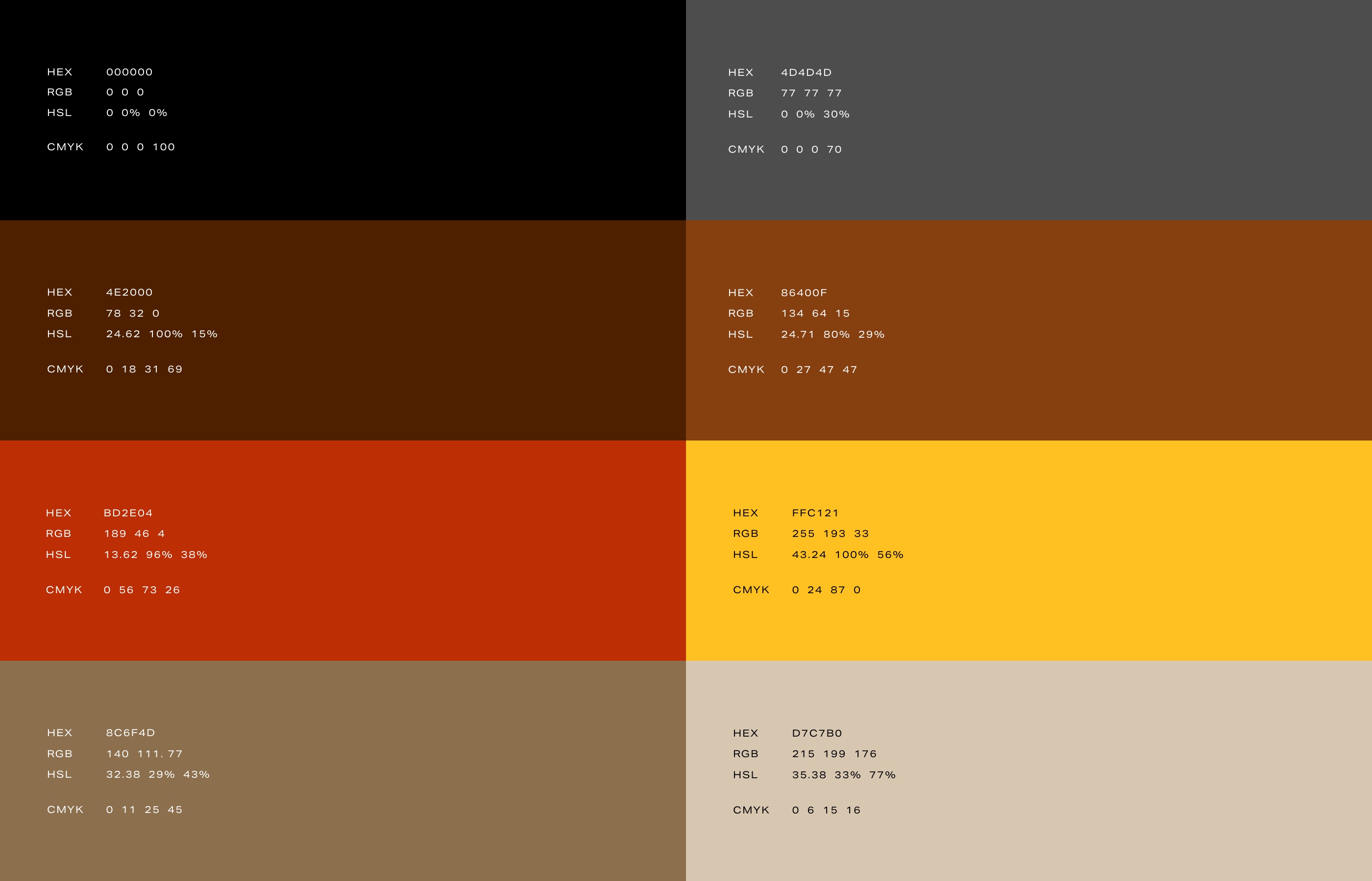
Darker and warm tonal colors are employed to give a sense of tactile richness—a call to man's draw towards collecting objects made of fine materials. The typefaces are a modern interpretation, influence by 19th and early 20th century medicinal packaging and product advertisements of the time.


